
Alon Netzer alonetzer.digital
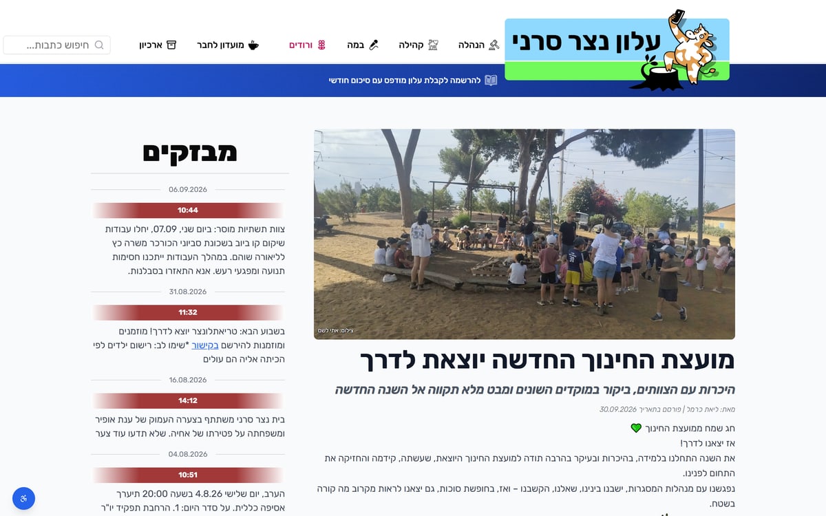
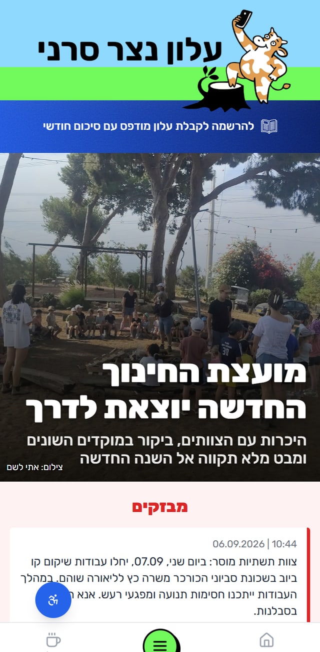
The online newspaper of Kibbutz Netzer Sereni: brand, editorial UX and the full build.

Opening the house…
The online newspaper of Kibbutz Netzer Sereni: brand, editorial UX and the full build.
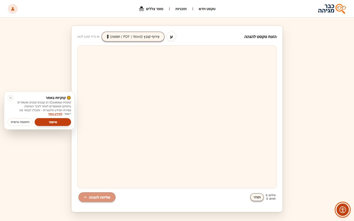
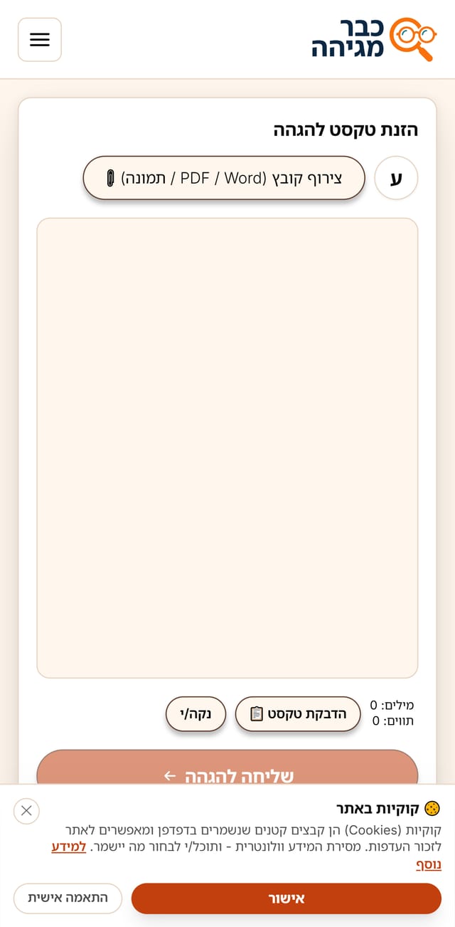
An AI-assisted Hebrew proofreading service: product design, UI system and frontend.
Selected work from my Master of Design in Visual Communication: research-led projects on the way to the portfolio.
A 70-second cut of my motion design and animation work from the last two years.
Case study · Web design and product
Design, UX and build for the weekly newsletter of Kibbutz Netzer Sereni. Hebrew, right-to-left, read mostly on phones by residents of every age.
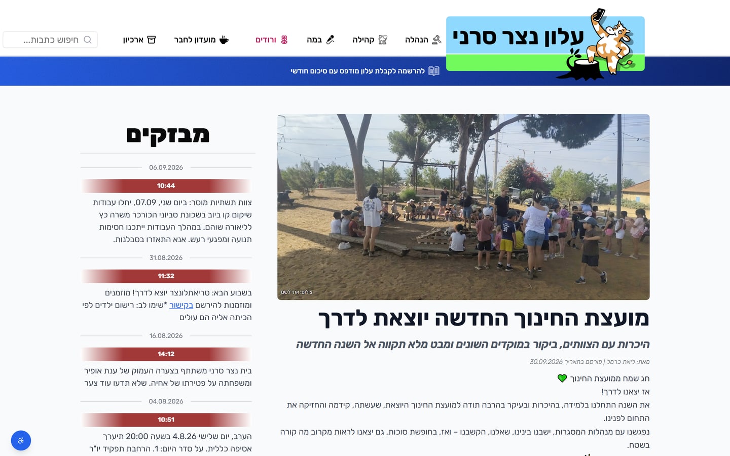
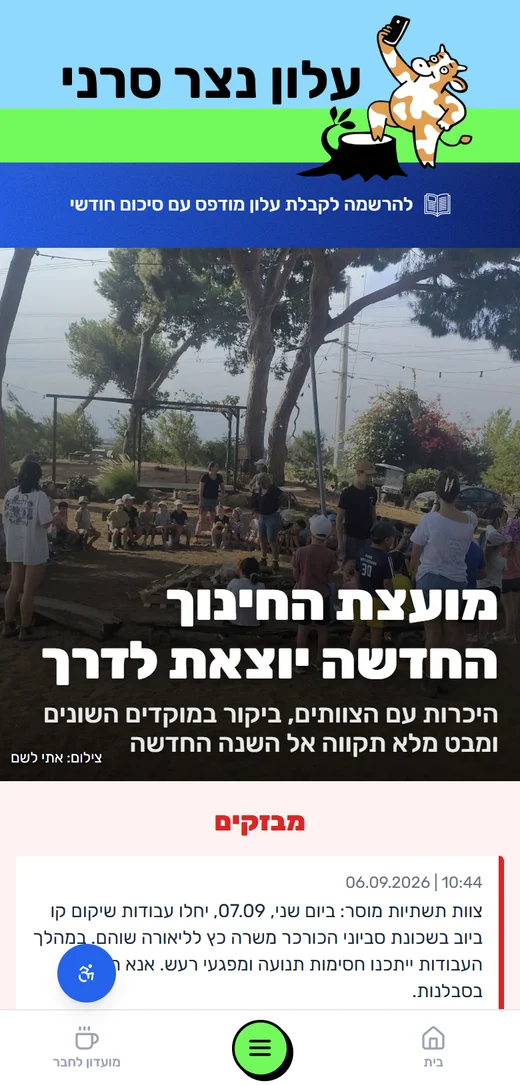
The public newspaper, the editors’ console, and a structured content model behind both.
Home, sections, article, flash feed, Vroodim, Members Club, archive, gallery, search and register.
Content, flashes, users, mailing, archive, Members Club, Vroodim, analytics and settings.
Editorial, live content, community, people, outreach and configuration.
A new issue or a flash arrives.
The lead story and the ticker.
Read, share, and find related stories.
Greet, play, and come back.
The printed issue as a PDF.
The main editor sees all nine admin sections. Content editors see Content, Flashes, Members Club and Vroodim. Readers never sign in unless an article is limited to residents.
The layout borrows newspaper hierarchy so the community reads it like the paper they already know.
A large photo and a 50 px headline give the page a clear entry point. Editors can pin any article as the lead.
Short alerts sit in a dated side column with red time stamps, so urgent items never compete with features.
Headline, subtitle, flash and date sizes are settings, not code. Editors adjust hierarchy without a redeploy.
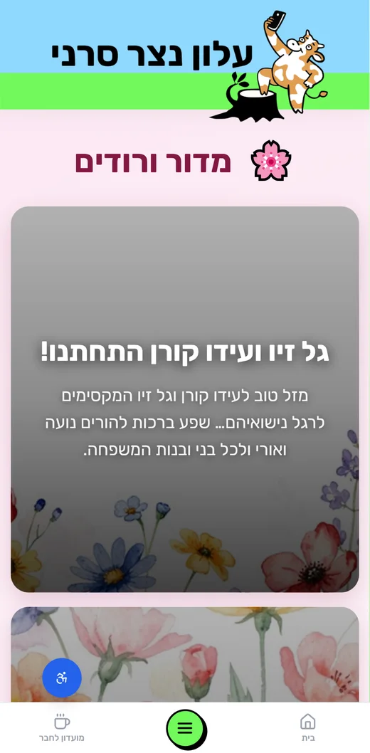
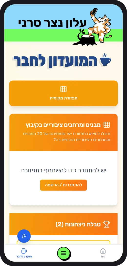
The mascot and lime stripe carry warmth; underneath, a strict two-column grid keeps reading calm.
Each section owns a tint and an icon, so readers know where they are before reading a word.
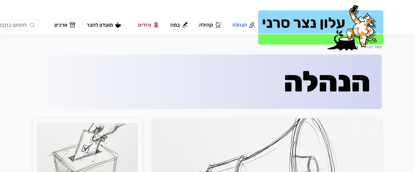
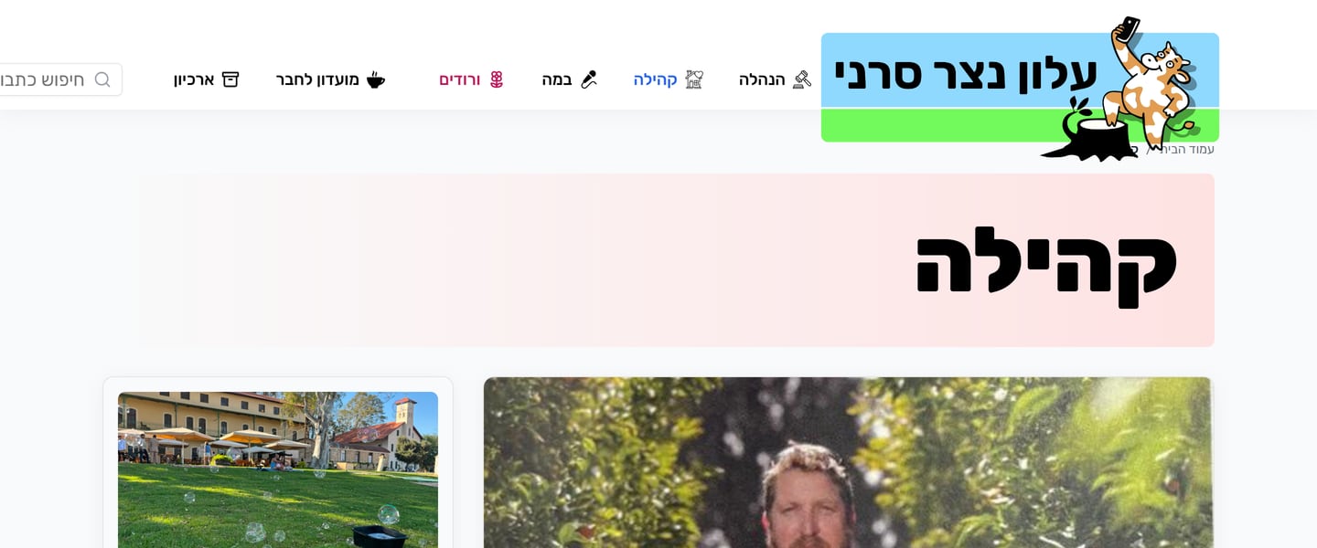
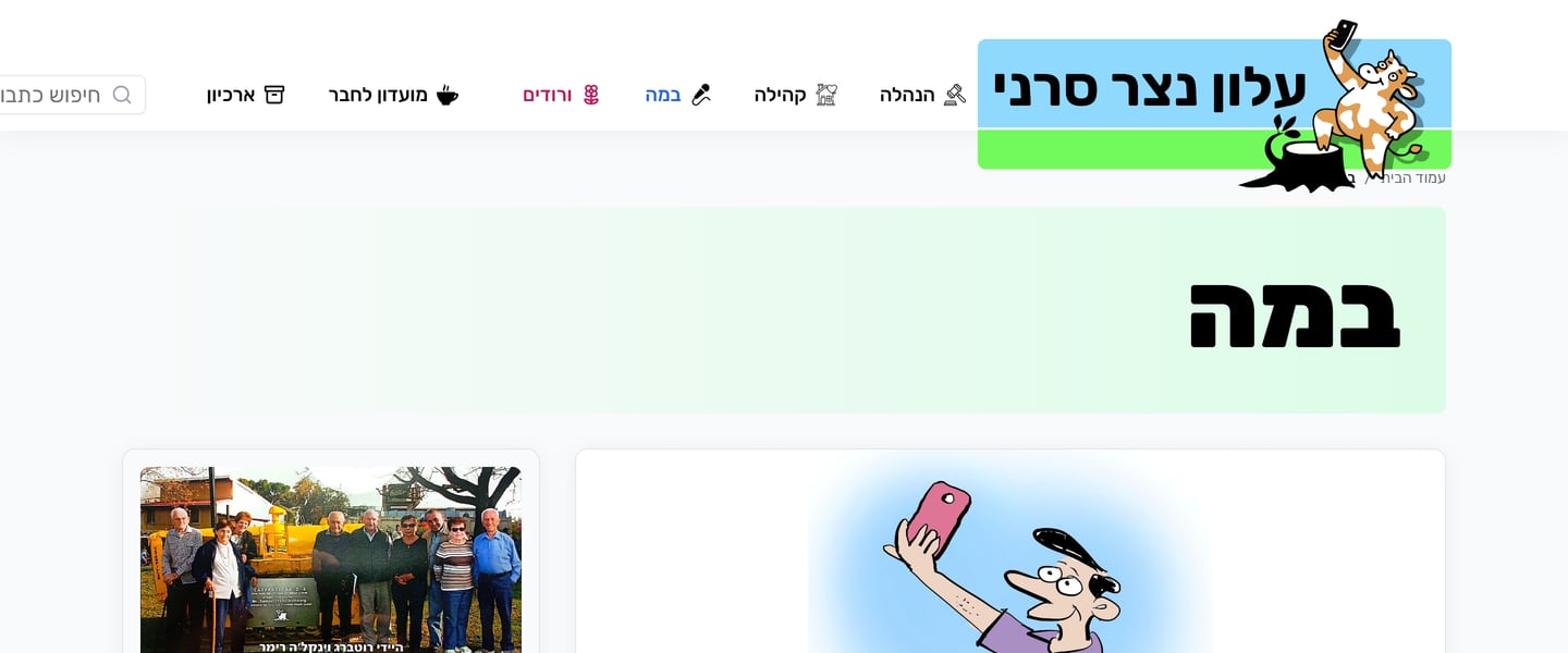
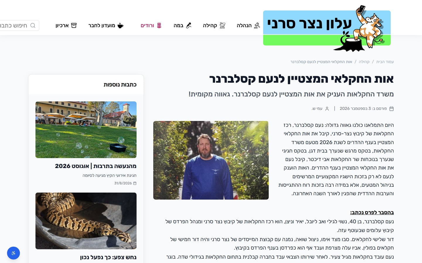
A soft gradient band with the section name in heavy Rubik replaces a generic page title.
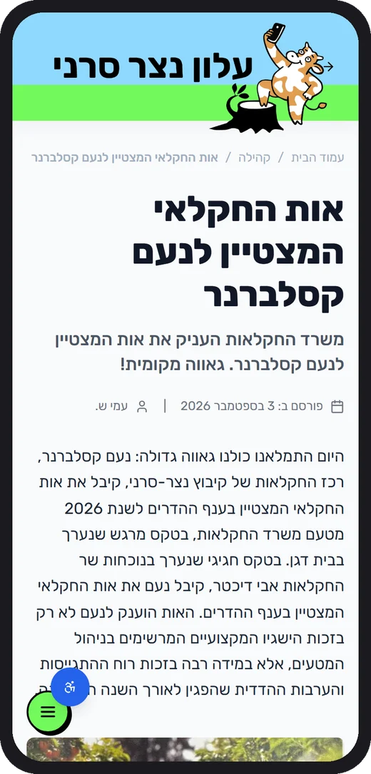
Each article stores a desktop and a mobile lead image with its own focal point, so faces are never cropped on phones.
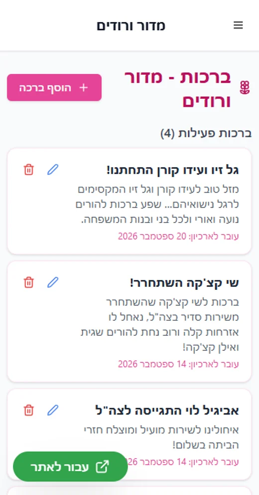
Most residents open the newsletter from a WhatsApp link on their phone, so the phone layout was designed first.
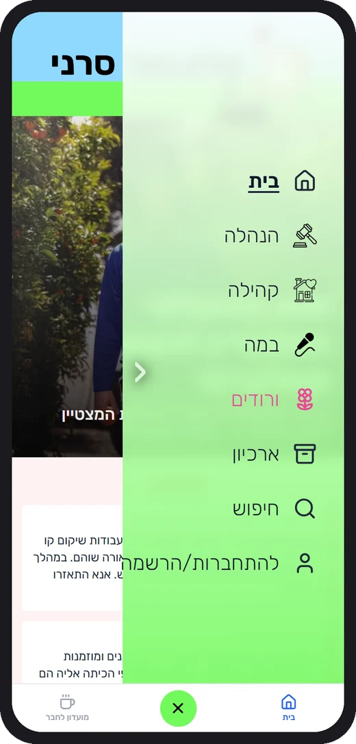
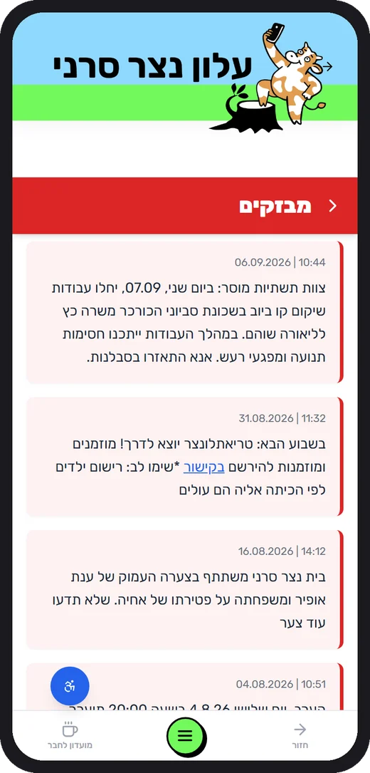
Home, a big lime menu button in thumb reach, and the Members Club. Nothing hides in a hamburger corner.
Pull-to-refresh, a red flash timeline with date pills, tap-through cards, and push notifications for new content.
A commercial news site is built to keep you. A community newsletter is built to inform you, connect you, and let you go.
Habit and headlines; every story competes for a click.
To find out what is happening to people and places they know.
An anonymous consumer, one of millions.
A neighbour and a member, sometimes the subject of the story.
An endless, algorithm-sorted feed.
Short, predictable paths. You finish and leave in minutes.
Time on site, page views, ad revenue.
Information delivered, a greeting shared, a neighbour helped.
Masthead. The sky band behind the mascot on every page.
Stripe · menu button. The lime stripe under the header and the big thumb-reach menu button.
Flashes · urgent. Time stamps and pills in the flash ticker: read this now.
Vroodim · joy. The pink page: greetings, celebrations, kids of the year.
Links · actions. Every link and primary action across the site.
Members Club. Games, puzzles and the leaderboard live on cream.
Editors are community members, not developers. The console hides complexity behind nine plain sections.
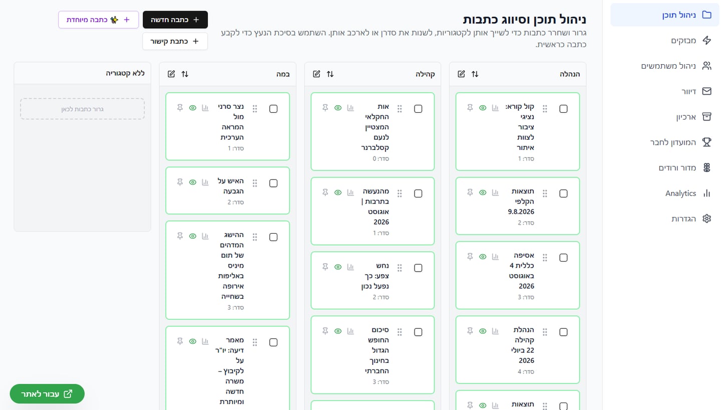
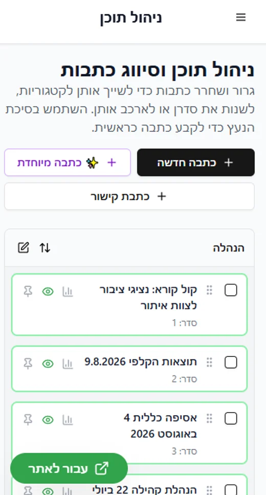
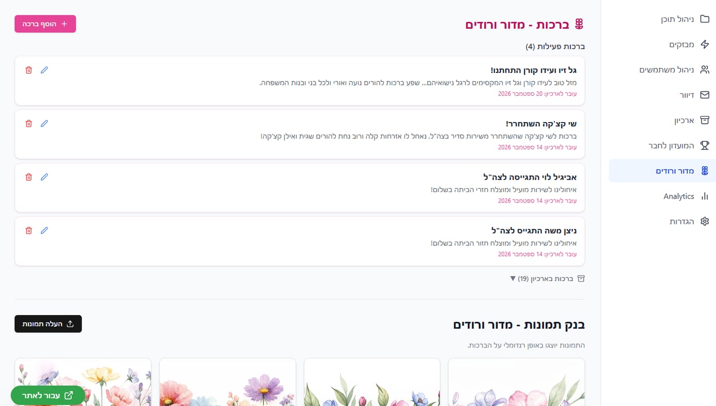
Content, flashes, users, mailing, archive, Members Club, Vroodim, analytics and settings. Content editors get the four they need; the main editor sees all nine.
Text, image, row, button and file blocks; desktop and mobile lead images with focal points; drafts, scheduling, pinning, residents-only access and preview.
One display face, Rubik, at heavy weights gives Hebrew headlines a newspaper voice. Colour arrives only as meaning: section tints, red for urgent, pink for joy.
Not a blog: a front page, sections, a ticker and an archive, mirroring the printed paper. Community rituals live inside the newspaper instead of scattered WhatsApp groups.
Thumb-reach navigation and a full-screen menu on mobile; classic top navigation on desktop. An accessibility widget, an open-access mode, and resident-only gating for sensitive items.
Case study · Product design
Product design, UX and full build on Base44 with a Gemini backend. The home page is the tool: paste, send, get a corrected text and a report.
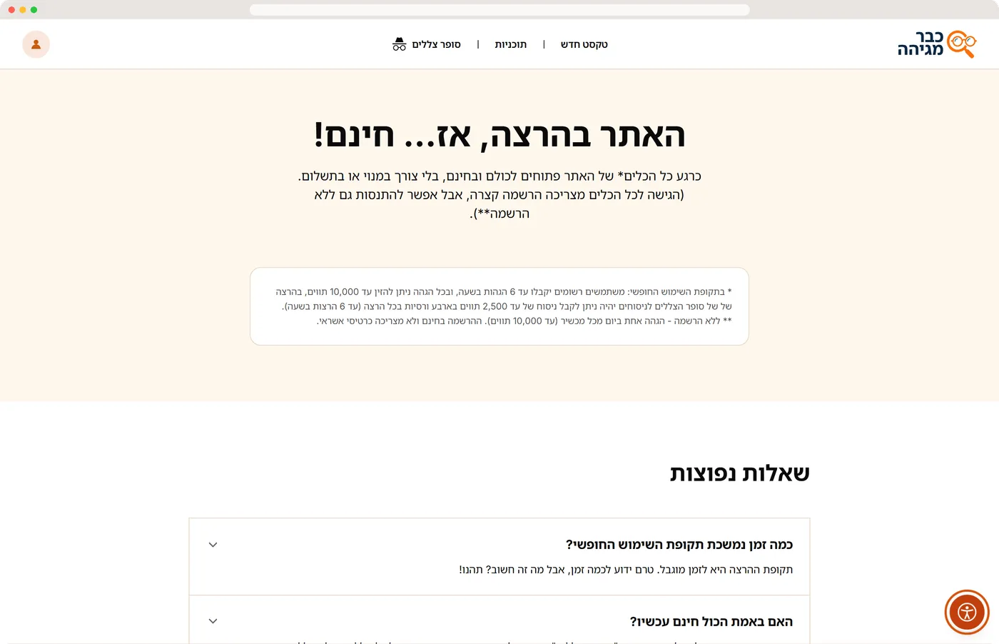
No marketing hero page stands between the visitor and the value. A flat, shallow tree where every page is one click away.
The home page is the workspace. Around it: pricing and FAQ, about, contact, terms of use and accessibility.
Login and register, Google sign-in, password reset, profile and history, checkout, shared proofreads, saved texts, Shadow Writer mode and consent.
Overview and KPIs, content CMS, plans and prices, bot settings, data files, fun facts, codes, messages, users and saved texts.
Each proofread has its own shareable page, which turns every result into a small landing page for the product.
The admin lives inside the same app and design system, so the owner edits any text on the site in minutes, in the same visual language.
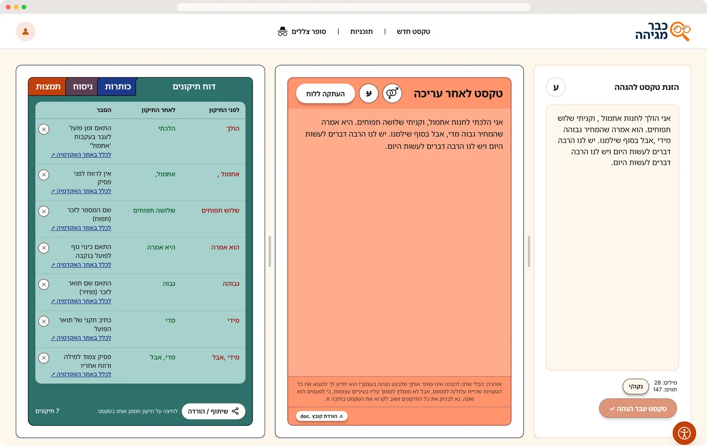
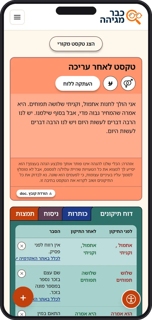
Source text, corrected text and the correction report, in Hebrew reading order. Salmon means “this text has been edited”; the muted cream input stays quiet.
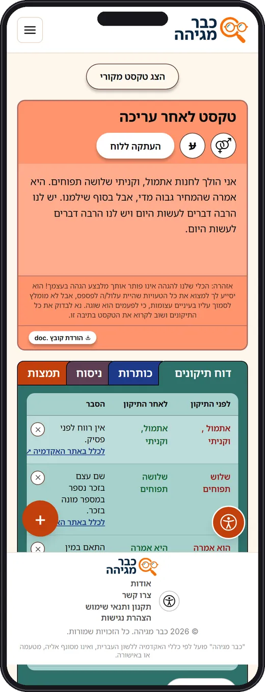
Before, after, and the rule that was applied, each linked to the Academy of the Hebrew Language. The ✕ reverts one correction and updates the text.
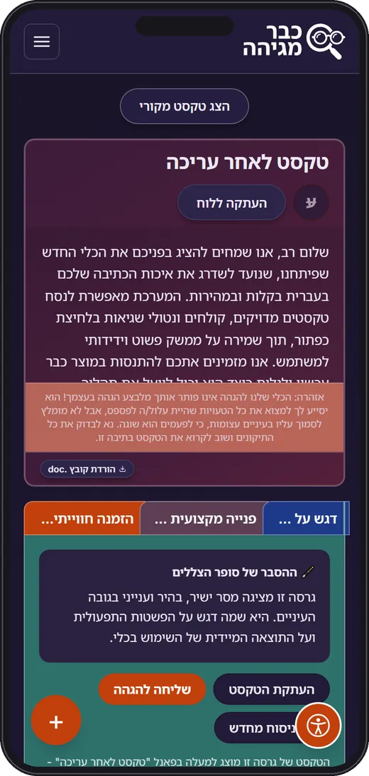
Four kinds of feedback, each with its own colour: the report in teal, headlines in navy, rephrasing in plum, the summary in orange.
Corrected text first, report below, a sticky + button for a new check and a “show original” toggle instead of a third column.
A cream canvas that feels like marking a printed page, with burnt orange reserved for the primary action.
Canvas. The page itself: marking a printed sheet on a desk.
Brand · CTA. The one bold accent, reserved for the primary action.
Edited text. The output panel: this text has been changed.
Report. The correction report tab and its table.
Headlines. Suggested headlines get their own tab colour.
Rephrasing. Rewrites and rephrasing suggestions.
Sign up · pay. Registration and payment: the second, rarer action.
Shadow Writer. The dark violet theme that flips on for the rewrite engine.
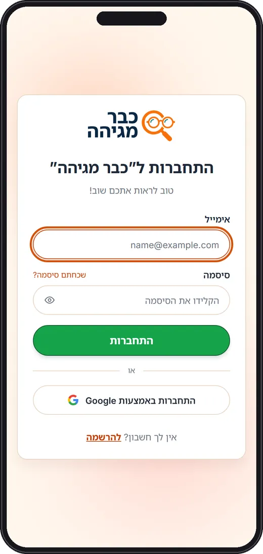
Pill buttons with a soft drop shadow are the only elements that float, so the eye lands on actions. White cards with a hairline border; text areas in a deeper cream read as a sheet on a desk.
Heebo and Inter, right-aligned, with generous line height. The logo, a magnifying glass wearing reading glasses, doubles as favicon and app icon.
Switching modes flips the entire theme to dark violet, so the user always knows which engine is working.
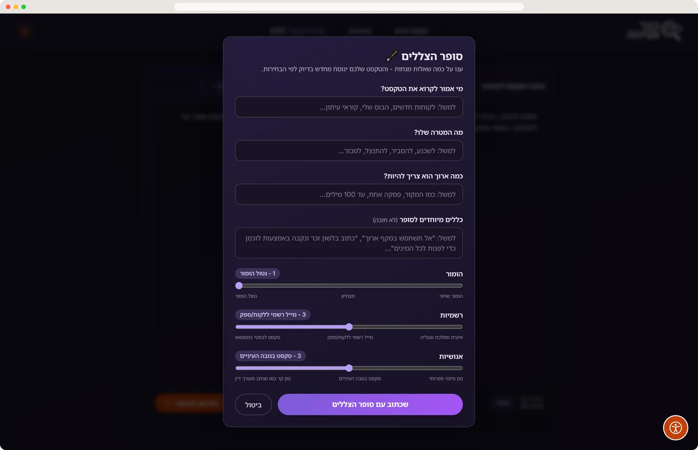
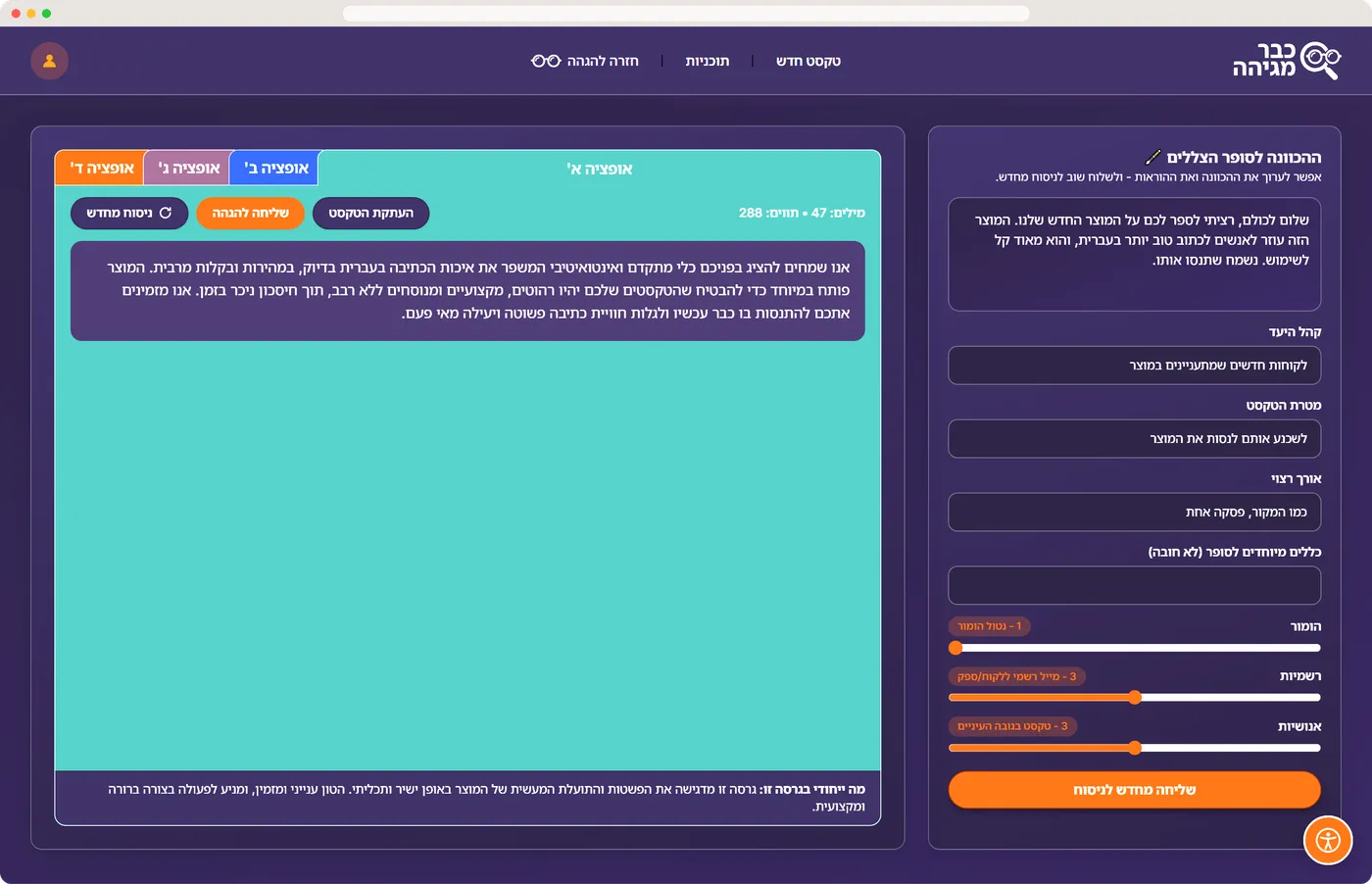
Three plain questions (who reads it, what for, how long) plus optional house rules. The user never writes a prompt.
Humour, formality and humanity run 1 to 5, but the labels speak: “WhatsApp to a friend” up to “royal letter”.
The model returns four rewrites, each with “what makes this version different”. One tap sends the pick back to proofreading.
Accessibility is a feature, not a plugin: preferences apply before the page paints, so nobody sees a flash of the default layout.
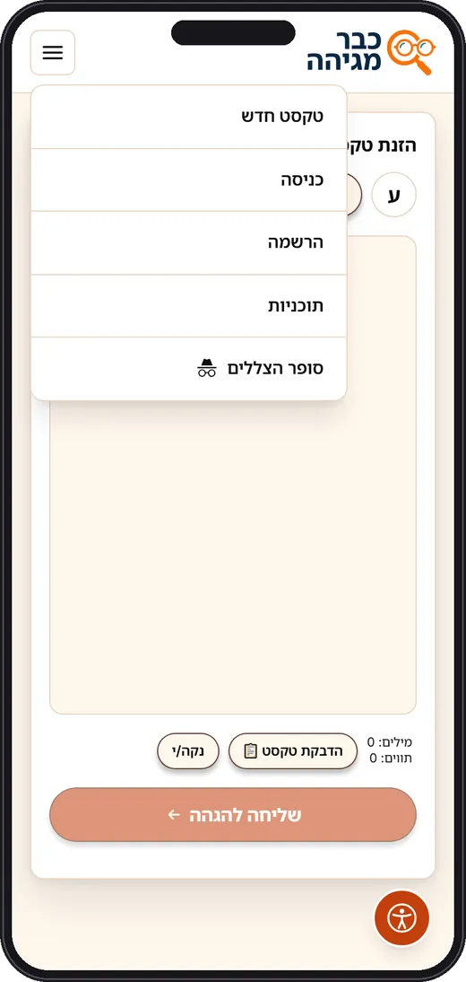
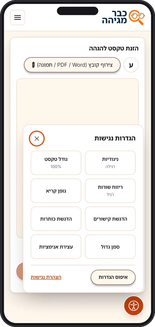
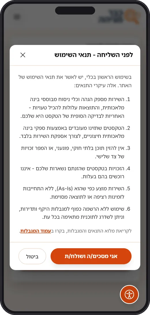
Guests see Login and Register; members see Profile. Shadow Writer keeps its icon so it is recognisable in both.
Text size, line spacing, contrast, readable font, link and heading highlights, big cursor, stop animations. Saved locally. Israeli standard 5568 and WCAG 2.0 AA.
Six plain sentences explain that AI processes the text and that the user keeps the rights. Shown once. A dedicated “paste text” button removes the long-press dance on mobile.
A ten-section console with the brand palette inverted: orange rail, cream workspace, white cards. The owner never learns a second interface.
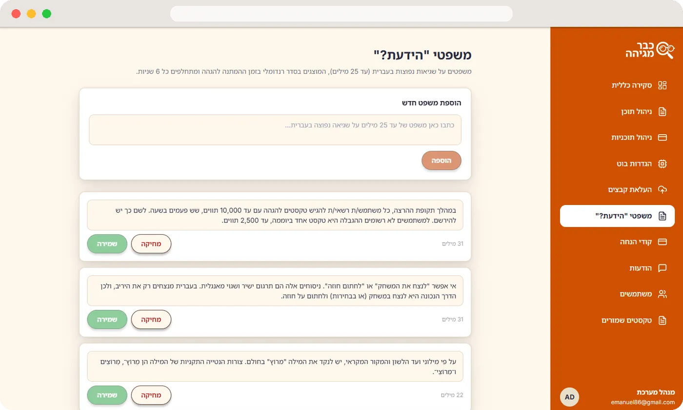
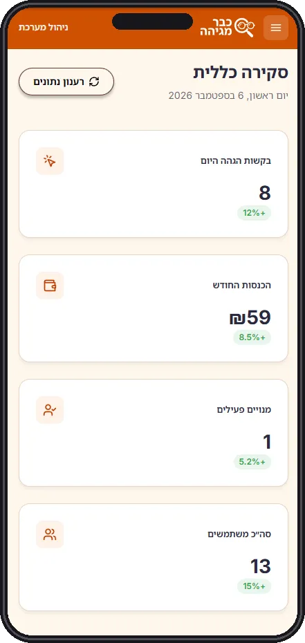
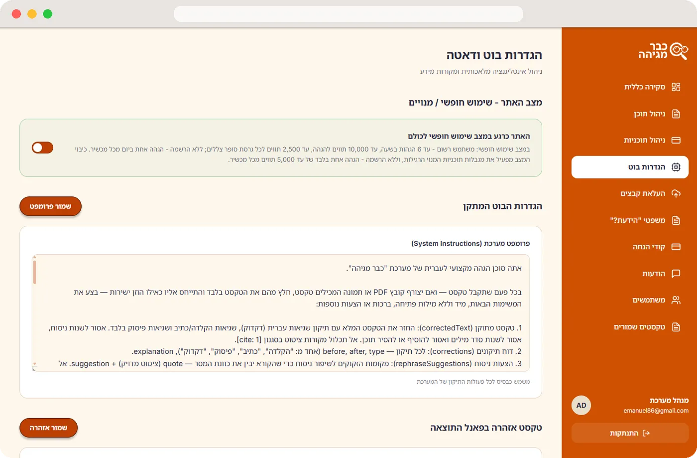
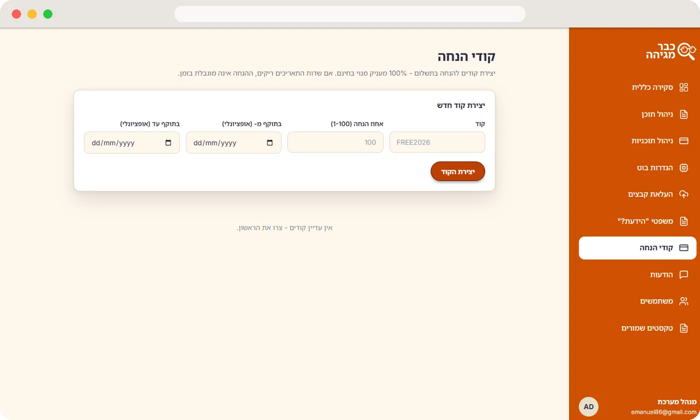
Four KPI cards with trend chips.
Every fixed string, with reset to default.
Launch mode, instructions and data files.
“Did you know” facts, codes and the inbox.
Users, saved texts and message triage.
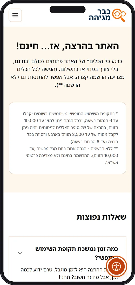
Every conversion moment keeps the same visual rules: one orange action, everything else stays quiet.
No sign-up wall; value within seconds.
Plain-language terms on the first send only.
Copy, download a .doc, or share a public page.
Email or Google, one card on a soft backdrop.
The total shows before any field.
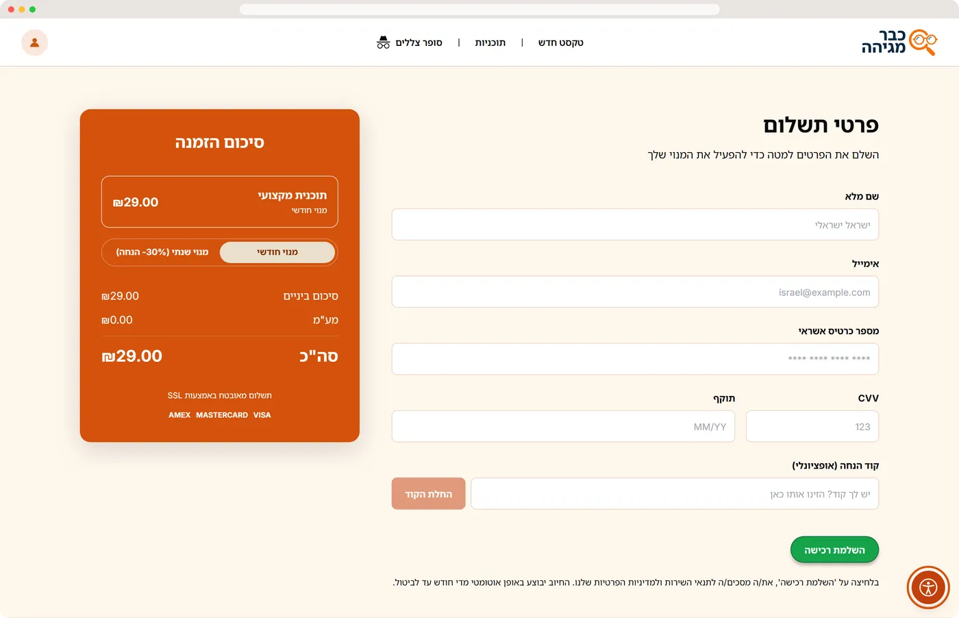
The order summary is the only orange block on the checkout page, so price and action are read as one unit.
Plan cards on mobile keep the recommended plan first and the free plan honest, in the largest type on the site. The FAQ answers how long it is free and what happens after.
October 2026
Art Director | Motion Design Lead | Creative Technologist
Art Director and Motion Design Lead with 12+ years across tech, media and entertainment brands; M.Des in Visual Communication, Bezalel. Builds and runs creative workflows, sets up design systems that hold across platforms, and closes the gap between design and engineering with front-end code (JavaScript, WebGL) and AI tools in production.
Colour as meaning
Tap or swipe for the next colour
Leaving to LinkedIn
This link opens in a new tab. You can also copy the address instead.
Call me
Email me
Write to me
Opening the house…